A Modern Take on The Hero Slider
The homepage of TRUNO’s website housed a single video that played through a grid of elements, all set at different colors and opacities. We chose to use this modern approach instead of a slider, in order to provide a fresh experience to the user. The following video shows a short screen recording of this unique feature.
Mobile-First Design
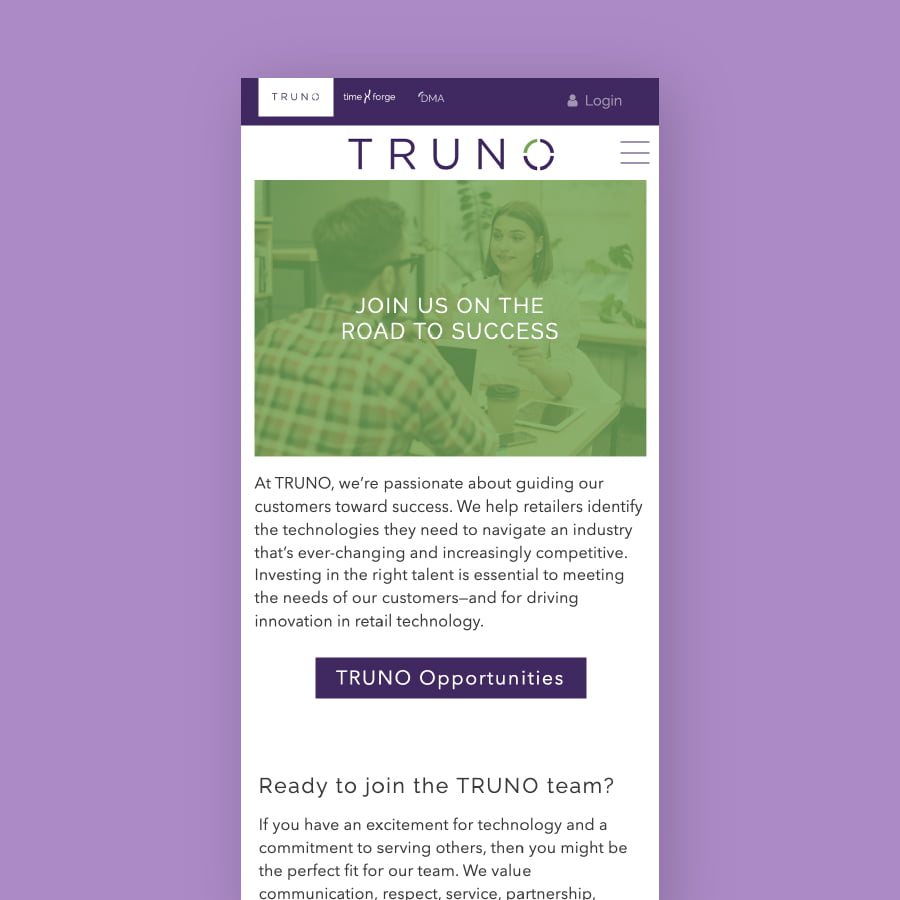
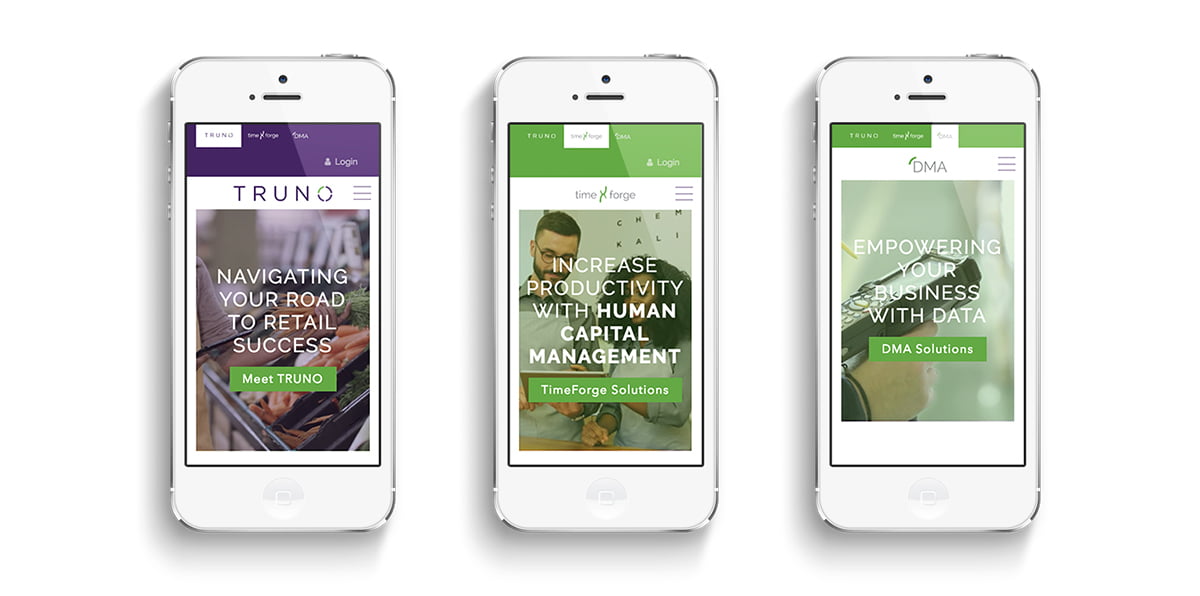
The website was developed following the principles of mobile-first design, including slimmed-down mobile navigation built just for touch screens.


Custom Interactive Experiences
In addition to the website, we worked with the TRUNO team to develop interactive content that would help to educate visitors about their product offering. The example above is a digital eBook that walks users through how implementing one of TRUNO’s products will help them to solve their current business stressors and issues. Each pain point is presented as a ‘headache’ that is relieved by the implementation.
A Unique, Personalized Blog Experience
Another unique feature of the TRUNO website is their blog. Through HubSpot’s personalization capabilities, we built a blog that the user can customize according to their interests. The user can do this by selecting the topics relevant to them, which them updates the blog feed to show only those topics that they have selected.


